Pravha:
Does a beer brand need to look like all other beer brands? No.

Pravha became Molson Coors’ most successful launch to date.
Here’s how.
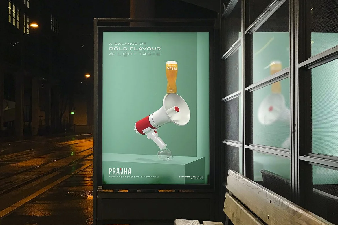
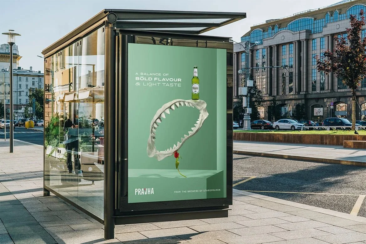
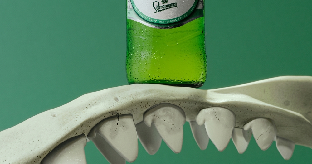
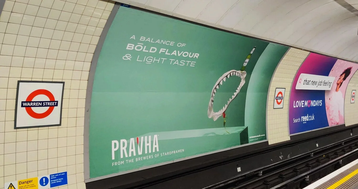
Four words on the bottle: “Bold flavour. Light taste.”
At first, it didn’t make sense. Then it clicked. The contradiction wasn’t a problem—it was the idea.
So we built the brand around it.
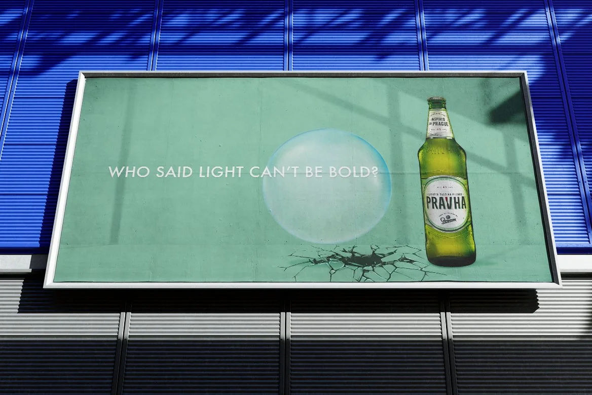
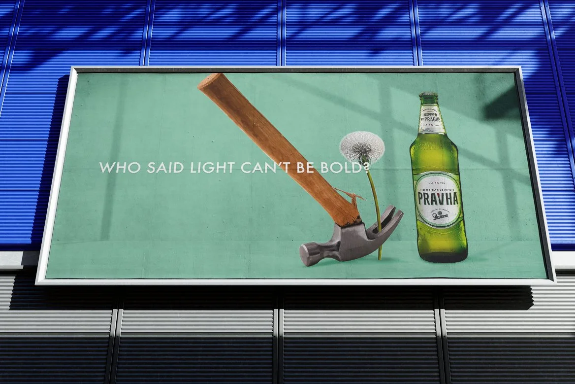
In a sea of big pint advertising, with a fraction of the budget, we chose to own a colour. Duck egg green. And treat the bottle like a fashion object, not a beer—creating a visual world that could live consistently across every touchpoint.
We brought in Metz+Racine with one instruction: don’t make a beer ad.
Keep it simple. Talk about the product. No nonsense about who you’ll become if you drink it.
The thinking didn’t stop with us. Molson Coors rolled it out across every touchpoint—PR, events, everything—so the brand showed up the same way everywhere.
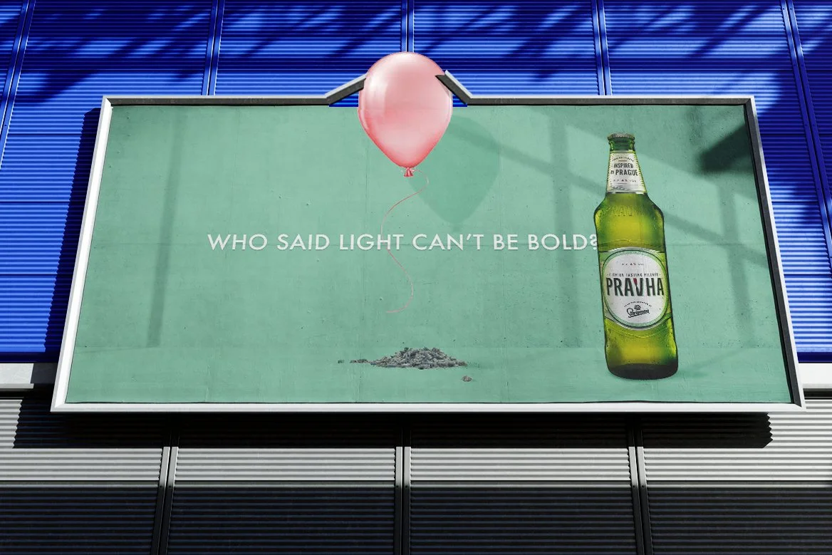
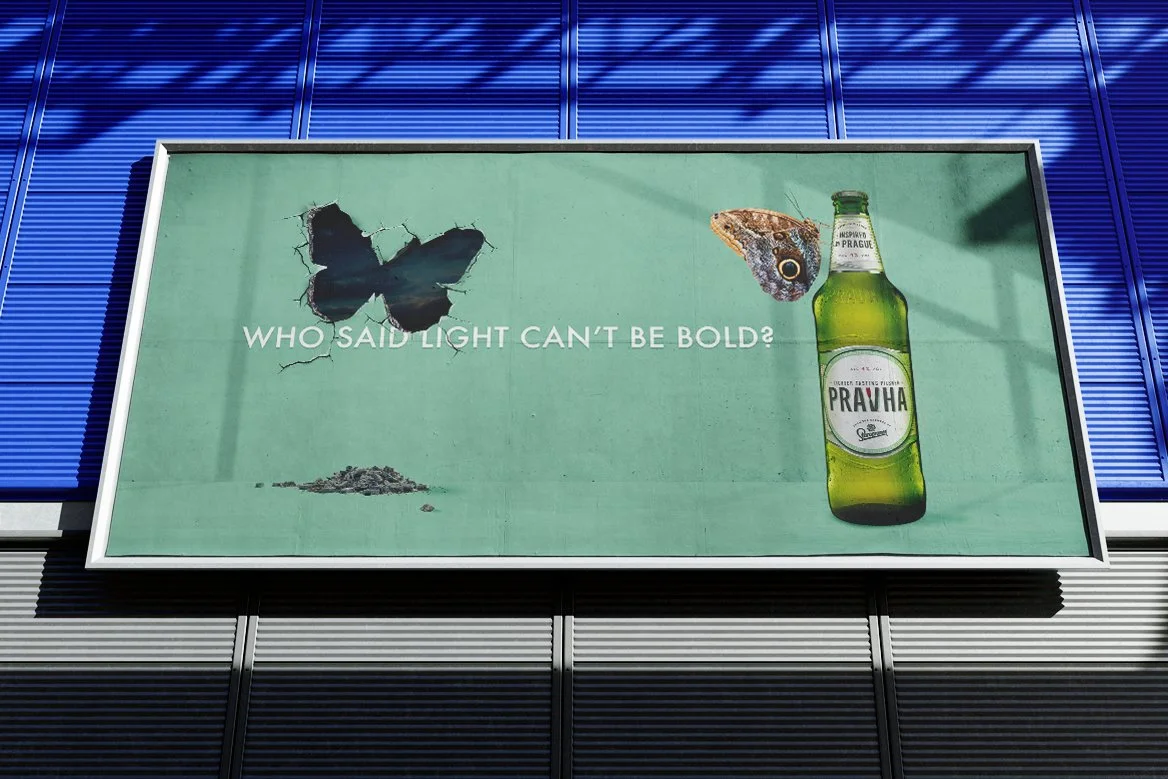
Year two stayed in the same world and asked - Who said light can’t be bold?